

Getaway Competition
Client: Green and Black’s
What: Green and Black’s asked us to create an exclusive competition to win a luxury getaway. The campaign needed to work seamlessly with the existing Green and Black’s packaging.
How: The campaign needed to work with Green and Black’s core brand look and feel whilst also conveying the idea of relaxation and retreat. So, as part of the Key Visual design I created a set of expressive paint marks and lino cuts to be used as assets for the competition.
Design · Art Direction · Linocut · Asset Creation
BD Network 2019

Initial Experiments using linocut and expressive paint marks.
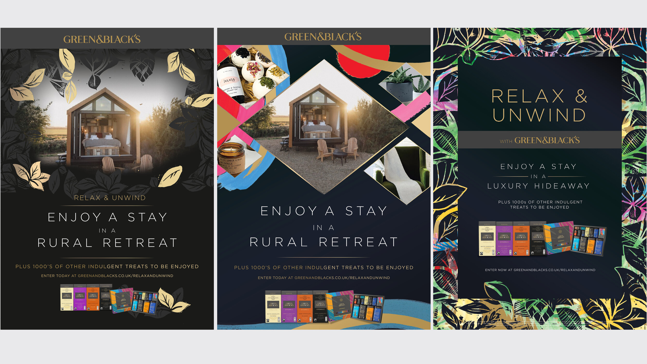
Key Visuals created using linocut prints and expressive paint marks. The central image was chosen to be used as the main campaign visual.

Full page advert for Waitrose

Waitrose Web Banner
Smooth Sampling
I was asked to design and visualise an activation space with a small footprint where we could offer a label personalisation service. This was part of a larger piece of work launching the Green and Black’s velvet range.
Design
BD Network 2018

2m x 2m activation space with sampling